
Introduction
Are you struggling to make your website work well on both phones and desktops with responsive layout services right from the start? If your answer is yes, you are not alone. In the Philippines, most people browse the web on mobile devices, and a site that adjusts smoothly to every screen size can make all the difference for your visitors and your business success.
Responsive layout services help your website shift and scale content based on whether someone views it on a smartphone, tablet, laptop, or large monitor. This kind of flexibility keeps users happy, keeps them exploring, and keeps them coming back for more.
Let’s talk about why responsive layout services are so important and how they improve UI/UX design for Philippine audiences.
What Makes a Good User Experience
Before we go deeper, let’s break down what UI and UX really mean in a simple way.
- UI (User Interface) is about how your website looks — the colors, buttons, layout, and how visually pleasing everything appears.
- UX (User Experience) is about how it feels to use your website — how easy it is to find info, take action, or complete a task.
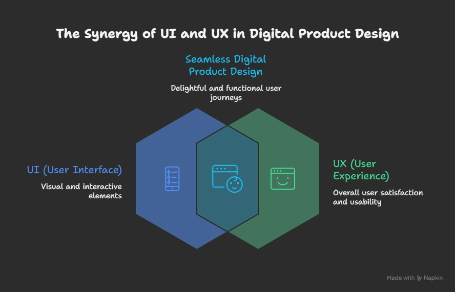
When your site feels smooth, effortless, and intuitive, your users enjoy sticking around longer. That feeling of ease and flow is the core of good UI/UX design. Google has shown that positive user experience plays a big part in how often people return to a site and even how search engines view your site in rankings.
Responsive Layouts Support Better Navigation
Imagine this: someone in Cebu accesses your website on a phone, but the menu buttons are tiny and hard to tap, and they have to scroll sideways just to read your content. Frustrating, right?
Responsive layout services eliminate that hassle. A responsive layout reshapes content automatically so navigation is easy, menus are simple to tap, and content flows down the screen without messy pinch-and-zoom moves. This design philosophy is especially important in the Philippines, where the majority of internet users browse on smartphones.
When navigation feels natural and effortless, users feel in control, and they are more likely to explore deeper into your site. That’s good for them and great for your business.
Faster Performance and Engagement
Fast-loading pages is not a luxury, they are an expectation. A responsive layout helps your site load efficiently because it avoids sending heavy or unnecessary elements to smaller devices. That alone can reduce bounce rates and keep users engaged.
A smart approach that ties into responsive layouts is mobile-first web design development. This means building your site starting with the smallest screens first, then scaling up. With this strategy, performance is prioritized from the earliest stages of design, which leads to faster experiences, less frustration, and more time spent browsing.
When your users stay longer and interact more, they are more likely to trust your brand and take action whether it’s clicking a service page, signing up, or buying something.
Building Trust Across Devices
Consistency builds trust. When your site looks and behaves predictably across all devices, your audience feels confident that it offers quality and legitimacy. Imagine someone visiting your site from a phone in Manila and then later returning from a laptop in Davao. If the website feels familiar and functions the same way both times, that builds credibility.
Responsive layout services ensure that your brand experience remains solid from the first tap to the final conversion. This leads to higher engagement and more return visits because people enjoy the experience and know what to expect each time they interact with your website.
Impact on Local Businesses
Responsive layout services are not just about technology. They are about helping businesses in the Philippines grow.
Here’s how:
- More satisfied visitors stay longer and explore more pages.
- Higher conversions happen when users can easily take action.
- Wider reach occurs because responsive sites work well on the devices most Filipinos use daily.
In the Philippines, where digital traffic is dominated by mobile and tablets, designing experiences that adapt to local preferences is key. That’s why UI/UX design Philippines professionals often focus on responsive strategies that mirror real user habits and expectations.
By tailoring your online presence to local browsing behavior, you open doors to more interactions, more leads, and ultimately more customers.
How It Fits into Overall Web Design
Responsive layout services are not a separate add-on or a shiny extra. They are a foundational part of modern web design that ensures every visitor gets the same great experience no matter where they come from or what device they use.
Good responsive design stands on three simple principles:
- Fluid layouts that shift seamlessly.
- Flexible images and text that resize naturally.
- Adaptable navigation that feels intuitive on any screen.
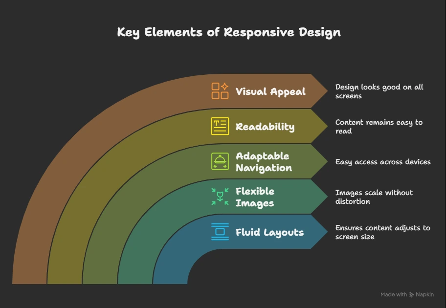
These principles make your entire web presence more accessible and enjoyable and that’s what keeps users coming back.
Conclusion
At the end of the day, responsive layout services improve UI/UX design by making your website feel effortless, accessible, and friendly. In a mobile-driven market like the Philippines, this isn’t just nice to have, it’s essential.
When your site adapts beautifully to every screen, loads quickly, and supports smooth navigation, it sends a message to your audience: you value their experience. And when users feel valued, your business gains trust, engagement, and growth.
Investing in responsive design today sets you up for stronger online visibility tomorrow. Whether you are a new startup or a growing brand, designing with responsiveness in mind helps you connect better with your audience and achieve lasting results.
Ready to upgrade your website experience?
Partner with Tech Support Plus IT Services and turn your site into a smooth, user-friendly experience across all devices.